An entry for the second @ravie.co#RavieChallenge! This time, the theme was to make a 30-second loop that reminds you of the word “Glint“, the deadline was in 10days.
We landed on the concept of chopping up the animation into five 6-second parts, each with our style. Then we all joined forces like Power Rangers with our animated elements before they turned into a lustrous glint.
The way how we divided the work around this is each person did a 6sec part and at the end there was one part that has a touch from everyone on the team and on which it represented all of our styles together.
My parts in this project were : first scene, color palette, finalizing on the last scene (not the hand animation, this was made by @tilenmourier_art). In this detailed case study I will walk you throught all the small details and work arounds we did to make this piece pop to life. I will be focusing mainly on my part here, if you want to know more about my collaborators work you can check their case studies on their websites. Let’s get started 🙂
Planning-Conception
The very first step we did was to word map the word we got on the prompt since it was a bit un-clear at first glance but after that we settled on the idea of each one of us could take a similar word from the map and use it as their main title and at the last scene to top everything off we will use the main word which is “Glint.”
This is somewhat of an interesting topic, I call it the “Action Graph” and what it shows is how much action there is in every scene. The reasons behind making this while on the planning section is so the animation looks stimulus and smooth throughout.
Moodboard
Of course in order to make something cool like this we need a source of inspiration, so we saved some amazing art from some of the best artists out there.
Storyboard
After we sort of figured out a half clear path of where this is going we started experimenting with the storyboard, the word I chose for my part was “Glass” so i had to follow this up on my sketch.
The color palette was made at the same time as the storyboard, we chose the feel of the animation and we agreed on “playfull”, “modern”, “glossy” so i knew I needed some colors that can match well as gradients.
Styleframes
Now finally the picture we imagined of the final result is not so blurry anymore, after we made the styleframes it was not as difficult from there especially when having such a solid plan for everything.
Animation
The part that everyone was waiting for, finally! Now this is where it gets interesting, I did take lots of directions to achieve the results I had imagined for example I spent plenty of time on secondary motion and perfecting easing all over the scene and it did look great such as the little cube around the sphere that is made of galss and can reflect the background as it goes by, little on that later. Now let’s dive into this!
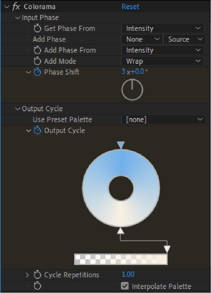
Let’s start with the most obvious, the animated gradients. The way i did that was using a combination of effects on a black and white gradient, since there is no way to simply animate the evolution of a normal gradient. here are the effects i used :
The sphere acting as the “Hero” was made simply by masking a could of shapes moving inside it with different shades to replicate the points gradient on illustrator.
The most complicated part that took the most time was this cube around the “Hero”, I had to use multiple expressions and effects to get close enough to what I have imagined it to look like at the end, The main issue I faced was the cube always gets messed up when I pre-comp it and use it somewhere else with the collapse transformations option turned on, eventually I found a way around it.
So basicaly there is a duplicate of the cube on the background that is fully black and it has rounded corners using the effects shown below, then there is a white outline in top, the way that was made was using an expression that makes the square shapes appear visible only when they are in front (toCompVec), if they are on the back they go 0% opacity.
And that’s it! the cream of the crop. The project took us 10days with this amazing team most of the steps went smoothly since we were extremely organized, if you’re interested on how the other parts were made please visit my team’s websites ( @imse_ty, @declosdesign, and @tilenmourier_art ).